diamond painting: the meaning and selection of different colors
Of all the crafts, diamond painting is a creative form that’s both relaxing and captivating. The satisfaction of attaching each tiny diamond, one by one, and watching the pattern transform from a blur into a whole is truly soothing. But the magic of diamond painting isn’t just in the sparkle of the diamonds—the color is what truly imbues it with emotion.
. Every color subtly influences our emotions and feelings. Understanding color psychology can help you make more thoughtful choices when selecting diamond painting sets, color schemes, or even your own DIY designs. Let’s discuss the color language hidden in diamond painting.
1. Why is color psychology so important to diamond painting??
To put it bluntly, diamond painting isn’t just a craft; it’s a visual art form. The combination of colors determines the overall mood of the painting—is it warm and cheerful, or tranquil and dreamy?
. Scientific research has long proven that different colors have specific effects on human emotions. Red excites, blue calms, and green brings a sense of balance. These principles also apply to diamond painting.
When, for example,
When When you apply large areas of orange or red diamonds to an image, the whole picture becomes “hot”—like a summer sunset, full of power.
Conversely, if the primary color is blue or purple, the atmosphere instantly becomes “calmer,” even taking on a mysterious, dreamy feel.
Therefore, color is not just “decoration”; it is more like a language of emotion.
2. The psychological significance of common colors in diamond painting
Red: Passion and Power
Red always has the most “presence.” It symbolizes vitality, enthusiasm, and energy, but it also often evokes a sense of alertness or tension.
Advantages: Red diamonds instantly capture the visual focus, adding impact to a work.
Caution: However, excessive use can create a sense of restlessness and anxiety. It’s recommended to use red as a decorative accent within the composition, complementing it with off-white or beige tones.
Orange/yellow: sunshine and joy
Orange is a friendly and welcoming color; yellow conveys brightness, hope, and joy.
In diamond painting, warm yellow diamonds are often used as a “light source”—sunlight, lamplight, or the center of a flower petal.
Tip: Too much yellow can be glaring; try pairing it with gold, white, or soft browns to create a warmer, more natural look.
Green: Peace and Recovery
Green is a natural color that often evokes a sense of peace. It can alleviate anxiety and balance emotions.
Advantages: Posting green artwork for extended periods of time can reduce visual fatigue.
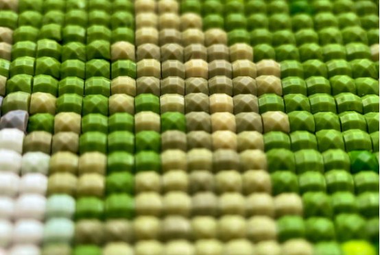
Recommendation: Choose a medium-brightness green, such as grass green or mint green, and pair it with beige or wood tones for a fresh and soft atmosphere.
Blue/Purple: Tranquility and Mystery
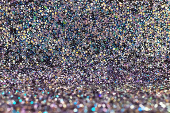
Blue evokes the ocean and the night sky—calm and profound—while purple is more dreamy and spiritual.
Suitable scenes: starry skies, water surfaces, and abstract, dreamlike diamond paintings.
Note: Too much blue or purple can create a cold, neutral look. Adding some gold or warm brown diamonds can add warmth.
Earth tones (brown/beige/camel)
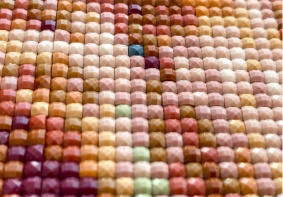
These colors are understated yet richly textured. They represent stability, calmness, and nature.
Pros: They’re great as backgrounds or backdrops, allowing the subject to stand out.
A word of caution: Too many earth tones can appear dull. Pair with brighter diamonds for a layered effect.
Black, white, gray and metallic colors: harmony and contrast
Silver and white symbolize purity; black brings depth and mystery, and gray is the perfect transitional color.
While gold, silver, and diamonds aren’t strictly colors, their reflective qualities can instantly elevate a piece’s aesthetic.
Recommendation: Use a small amount on borders, light reflections, or text details to enhance the image’s brilliance.
3. How to use color psychology to choose diamond painting
1. Think about how you want to feel first
Before you begin, ask yourself this question: “What emotion do I want this painting to bring out in me?”
- For warmth and joy, use red, orange, and yellow.
- , use For tranquility and calmness, use blue, purple, and dark green.
- Want natural and comfortable? → brown, camel, green.
- For a sparkly and sophisticated look, add gold, silver, white, or black details.
2. Keep the color ratio balanced
A good diamond painting usually has:
- Main color 50–70%
- Secondary colors: 20–40%
- Highlight/Detail Color 5–10%
For example, for a painting with a nature theme, you can use green as the main color, supplemented with light yellow or brown, and then embellished with a small amount of gold diamonds. This will not only create a clear layering but also make it more attractive.
3. Pay attention to the color difference of the actual diamond grains
Interestingly, while all brands share DMC color numbers, the results can vary slightly depending on the batch and sheen of the diamonds.
Tip: Check out photos taken by buyers before purchasing, or compare color numbers before mixing different brands to avoid embarrassing color shifts.
4. Use the “hue shift” technique
If you’re designing a DIY diamond painting, consider softening the primary color. For example, add a touch of gray-blue to the blue or a burgundy to the red.
This creates a more layered look and reduces visual fatigue.
5. Give the picture a “highlight color.”
A painting can become monotonous if its colors are too balanced.
Try adding a pop of color—a touch of bright yellow against a green forest, for example, or a hint of pink and purple against a blue night sky.
Those unexpected little highlights are often the most striking part of the painting.
4. Color matching direction for different themes
| theme | Recommended primary and secondary colors | Psychological effects of color |
| Flowers/Spring Scenery | Pink, light yellow, light green, white | Soft, fresh and cheerful |
| Starry sky/dream scene | Dark blue, silver gray, purple, white | Quiet, mysterious, contemplative |
| Festivals/Celebrations | Red, gold, green, white | Warm, festive, and prosperous |
| Modern Abstract/Minimalist | Black, white, wood, metallic | Simple, sophisticated, balanced |
| Animal/Children’s Themes | Bright yellow, sky blue, pink, bright green | Lively, cheerful, and childlike |
These color combinations aren’t absolute, but they can help you find your ideal vibe faster.
5. Avoid common color-matching traps
- Full high saturation color matching: too bright and garish, it will make you tired after looking at it for a long time.
- The ratio of main and auxiliary colors is unbalanced: too much single color will appear flat.
- Ignore the display environment: Consider the lighting and background color when hanging it in your home.
- Mismatched emotions: I wanted to relax but chose “intense red orange,” and ended up getting more annoyed the more I posted.
- There will be a big color difference when mixing brands: diamonds from different brands have different gloss, so pay attention to uniformity.
Conclusion: Let every diamond “color” your emotions
The next time you pick up a diamond painting set, slow down and look at the colors.
Ask yourself, “How does this painting make me feel?”
Color psychology reminds us that creation isn’t just about the hands; it’s about the heart.
When you carefully choose colors, it doesn’t just enhance the painting’s beauty; you’re using the color and the texture to speak to yourself.
From the warmth of red and the cheerfulness of yellow to the tranquility of green and the depth of blue, each diamond represents a pixel of emotion.
May your next diamond painting not only sparkle but also gently heal your heart.